


Dunwoody Wildcat Theatre presents Little Women, the Broadway Musical, based on the beloved novel by Louisa May Alcott. Set during the Civil War, this heartfelt…
There are future dates for this event
Ancillary Text Above
This is introductory text, it should be brief and entice the visitor to read more about the page, as it will show in related content blocks.
This is additional Summary text. It will display after the Intro text. Lorem ipsum dolor sit amet, consectetur adipiscing elit, sed do eiusmod tempor incididunt ut labore et dolore magna aliqua. Nulla facilisi morbi tempus iaculis urna id. Sit amet consectetur adipiscing elit pellentesque habitant. Accumsan in nisl nisi scelerisque eu.
Amet porttitor eget dolor morbi non arcu risus quis varius. Ut enim blandit volutpat maecenas volutpat. Vehicula ipsum a arcu cursus vitae. Urna et pharetra pharetra massa massa ultricies mi. Donec et odio pellentesque diam volutpat commodo sed egestas egestas. Libero volutpat sed cras ornare arcu dui vivamus arcu felis. Ullamcorper morbi tincidunt ornare massa eget. Diam maecenas sed enim ut. Orci porta non pulvinar neque laoreet suspendisse interdum consectetur. Nisl tincidunt eget nullam non nisi est sit. Congue eu consequat ac felis donec et odio pellentesque diam. Molestie nunc non blandit massa enim nec dui. Augue mauris augue neque gravida in fermentum et. Fusce id velit ut tortor pretium viverra suspendisse.
Aliquam etiam erat velit scelerisque in dictum non consectetur a. Tempor orci eu lobortis elementum nibh. Elit scelerisque mauris pellentesque pulvinar. Etiam dignissim diam quis enim lobortis scelerisque. Sollicitudin ac orci phasellus egestas tellus rutrum. Aenean pharetra magna ac placerat vestibulum lectus. Nunc pulvinar sapien et ligula. Sit amet risus nullam eget felis eget nunc lobortis mattis. Viverra maecenas accumsan lacus vel facilisis volutpat. Mauris pharetra et ultrices neque ornare aenean euismod elementum. Ac felis donec et odio pellentesque diam volutpat commodo. Vel eros donec ac odio tempor orci dapibus. Placerat orci nulla pellentesque dignissim. Varius duis at consectetur lorem. Iaculis urna id volutpat lacus laoreet non curabitur. Nisi quis eleifend quam adipiscing. Amet facilisis magna etiam tempor orci eu lobortis elementum nibh. Interdum varius sit amet mattis vulputate enim nulla.
Dolor magna eget est lorem ipsum dolor. Vitae congue mauris rhoncus aenean vel. Elementum sagittis vitae et leo duis ut. Pulvinar neque laoreet suspendisse interdum consectetur libero id faucibus nisl. Velit dignissim sodales ut eu sem integer vitae justo. Praesent elementum facilisis leo vel. Arcu felis bibendum ut tristique et egestas quis ipsum. Urna duis convallis convallis tellus id interdum. Eget arcu dictum varius duis at consectetur lorem. Eget lorem dolor sed viverra. Sem integer vitae justo eget magna. A erat nam at lectus urna duis convallis. Facilisis magna etiam tempor orci eu lobortis elementum nibh. Aenean pharetra magna ac placerat. Eget gravida cum sociis natoque penatibus et magnis dis parturient. Aenean et tortor at risus viverra adipiscing. Vitae sapien pellentesque habitant morbi. Leo duis ut diam quam nulla porttitor massa id neque.
Sed id semper risus in hendrerit gravida. Arcu dictum varius duis at consectetur. Pellentesque massa placerat duis ultricies lacus sed turpis tincidunt id. Donec massa sapien faucibus et molestie. Lacus luctus accumsan tortor posuere ac ut consequat semper viverra. Cursus in hac habitasse platea dictumst. Nisi scelerisque eu ultrices vitae auctor eu augue ut. Scelerisque mauris pellentesque pulvinar pellentesque. In arcu cursus euismod quis viverra nibh cras pulvinar mattis.
Ullamcorper eget nulla facilisi etiam dignissim. Aliquam sem et tortor consequat id porta. Interdum consectetur libero id faucibus nisl tincidunt eget nullam non. Sit amet tellus cras adipiscing enim. Diam vulputate ut pharetra sit. Sed id semper risus in hendrerit gravida rutrum. Lobortis scelerisque fermentum dui faucibus in. Dictumst quisque sagittis purus sit amet volutpat consequat mauris nunc. Urna et pharetra pharetra massa massa. Adipiscing commodo elit at imperdiet. Sagittis orci a scelerisque purus semper eget. Aliquet nibh praesent tristique magna sit amet purus gravida.
| Header | Header | Header |
| Body | Body | Body |
| 2 | 2 | 2 |
This is a rich text block. Use it for readable text on the page. When using a rich text block, you can select default (left-justified), center, or split (two column) layouts on the Settings tab.
You also have the option of selecting background colors on a rich text block. Please use this sparingly, and for no more than one paragraph of content at a time. The background colors are intended to be used as accents to break up long groups of text. Please avoid using background colors on adjoining blocks on a page.
Dunwoody Wildcat Theatre presents Little Women, the Broadway Musical, based on the beloved novel by Louisa May Alcott. Set during the Civil War, this heartfelt…

A place where can you drink coffee, eat fresh baked goods, and grocery shop for tonight's dinner all year-round! This is your one stop shop…

Try your hand at glassblowing under the guidance of an experienced professional! Each student will work with the instructor to create their very own glass…
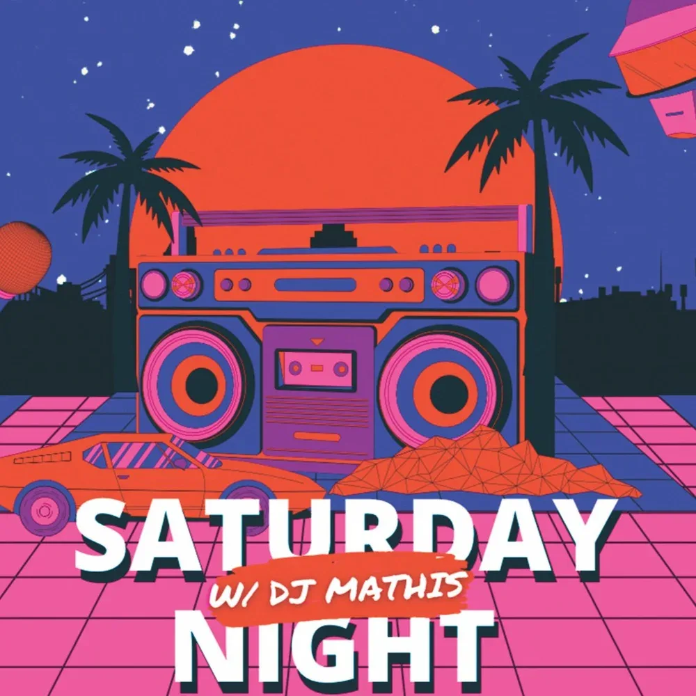
Get ready to turn up the weekend vibes at Politan Row! DJ Mathis brings the beats for an electrifying Saturday night of music, energy, and…

Spend your Sunday morning at the Shops of Dunwoody Farmers Market, where local vendors bring fresh flavors, handmade goods, and community fun each week. 🍎…

Her Brunch Club. Learn torah over breakfast.

Try your hand at glassblowing under the guidance of an experienced professional! Each student will work with the instructor to create their very own glass…

Join us at the Dunwoody Farmhouse gallery to experience Taking Shape: Works in Textile, Wood and Slate by artists Lauri Jones and Jeremy Morton.Artist Jeremy…

Join us at the Dunwoody Farmhouse gallery to experience Taking Shape: Works in Textile, Wood and Slate by artists Lauri Jones and Jeremy Morton.Artist Jeremy…

Join Outspoken Entertainment every Tuesday at 6 PM for Music Bingo at Politan Row! It’s free to play and a perfect way to unwind with…

Imagine a front row seat to one of the most unique dining experiences in the city. Executive Chef Patric Good will prepare a four-course menu…

Trivia Night Morty's hosted by Team Trivia GA Every Wednesday. Bring your smartest squad and get ready for some good food & fun! The game…

Ancillary Text Above
Custom Showcase Entry TextSubheading Below Heading
Lorem ipsum dolor sit amet, consectetur adipiscing elit, sed do eiusmod tempor incididunt ut labore et dolore magna aliqua. Nulla facilisi morbi tempus iaculis urna…

Ancillary Text Above
Custom Showcase Entry TextSubheading Below Heading
Lorem ipsum dolor sit amet, consectetur adipiscing elit, sed do eiusmod tempor incididunt ut labore et dolore magna aliqua. Nulla facilisi morbi tempus iaculis urna…

Ancillary Text Above
Custom Showcase Entry TextSubheading Below Heading
Lorem ipsum dolor sit amet, consectetur adipiscing elit, sed do eiusmod tempor incididunt ut labore et dolore magna aliqua. Nulla facilisi morbi tempus iaculis urna…
Ancillary Text Above
Ancillary Text Above


Lazy Dog Restaurant serves made-from-scratch American food and drink with seasonally-inspired ingredients. Influenced by the lifestyle of the Rocky Mountains where Founder Chris Simms spent…

Come join us today at Fleming's Steakhouse for the finest USDA prime beef steak and wine experience. Whether you’re celebrating, dining with business clients or…

What ZAGAT says about McKendrick's: "This high end power spot in Dunwoody competes with the best... steaks that are huge, tasty sides, an impressive wine…

As local residents, we noticed Dunwoody needed more BBQ joints and had no breweries. In 2017, we started the dream to bring this rare combination…

Ashford Lane is your go-to destination for shopping, dining & fun in Atlanta

Atlanta’s premier mall is located in at the heart of Dunwoody’s Perimeter Center district. Enjoy a relaxing dinner at one of the mall’s seven signature…

We are committed to provide our guest with an exceptional dining experience by offering our guest an extensive menu of Indian cuisine and attentive customer…

Moondog Growlers is where to go to buy a new growler or refill your own with great craft beer. A growler is a 32 or…

Georgetown Park offers a distinctive playground and a multi-use trail. The park's central square is graced by a grand gazebo, bocce courts and a decorative…

Located at 4770 North Peachtree Road, at 110-acres, Brook Run Park is the largest park in not only Dunwoody, but the region. This signature park…

A non-profit organization providing environmental education and outreach programs, visitors can enjoy the beautiful surroundings of the park or sign up for special classes and…

Located at 4809 Vermack Road, this park is just over 9 acres and includes an open field and a wooded area. “The public response to…
A non-profit organization providing environmental education and outreach programs, visitors can enjoy the beautiful surroundings of the park or sign up for special classes and…

Shopping in Dunwoody
Dunwoody is one of Atlanta’s top spots for shopping, with everything from national brands to locally owned boutiques. Whether you're hunting for the latest styles…

Discover your inner artist and enjoy classes and special events at the Southeast's largest community education center. Established in 1975, the Spruill Center for the…

Village Threads is a One-Stop-Shop for On-Trend, Stylish Clothing, Accessories and Gifts. The multi-brand specialty retailer carries a wide range of wearable and fashionable designs…
Ashford Lane is your go-to destination for shopping, dining & fun in Atlanta

Perimeter Mall
The second-largest mall in the Southeast and consistently one of the region's top performers; Perimeter Mall; located at the center of Dunwoody, Georgia, and has…

A cherished landmark and gathering place for more than 40 years, Park Place has been transformed into a modern village offering a peaceful respite from…

High Street brings together everything and everyone in a dynamic, lively community with refined apartment living, unparalleled connectivity, and unique shopping, dining, and entertainment. Welcome…
Georgetown Park offers a distinctive playground and a multi-use trail. The park's central square is graced by a grand gazebo, bocce courts and a decorative…

The Donaldson-Bannister Farm is located on 2.89 acres at the intersection of Chamblee-Dunwoody and Vermack roads. The circa 1870 house is listed on both the…
Located at 4770 North Peachtree Road, at 110-acres, Brook Run Park is the largest park in not only Dunwoody, but the region. This signature park…
A non-profit organization providing environmental education and outreach programs, visitors can enjoy the beautiful surroundings of the park or sign up for special classes and…
Shopping in Dunwoody
Dunwoody is one of Atlanta’s top spots for shopping, with everything from national brands to locally owned boutiques. Whether you're hunting for the latest styles…
Discover your inner artist and enjoy classes and special events at the Southeast's largest community education center. Established in 1975, the Spruill Center for the…
Village Threads is a One-Stop-Shop for On-Trend, Stylish Clothing, Accessories and Gifts. The multi-brand specialty retailer carries a wide range of wearable and fashionable designs…
Ashford Lane is your go-to destination for shopping, dining & fun in Atlanta
Perimeter Mall
The second-largest mall in the Southeast and consistently one of the region's top performers; Perimeter Mall; located at the center of Dunwoody, Georgia, and has…
A cherished landmark and gathering place for more than 40 years, Park Place has been transformed into a modern village offering a peaceful respite from…
High Street brings together everything and everyone in a dynamic, lively community with refined apartment living, unparalleled connectivity, and unique shopping, dining, and entertainment. Welcome…
Georgetown Park offers a distinctive playground and a multi-use trail. The park's central square is graced by a grand gazebo, bocce courts and a decorative…
The Donaldson-Bannister Farm is located on 2.89 acres at the intersection of Chamblee-Dunwoody and Vermack roads. The circa 1870 house is listed on both the…
Located at 4770 North Peachtree Road, at 110-acres, Brook Run Park is the largest park in not only Dunwoody, but the region. This signature park…
Cookies Policy
This website uses cookies to enhance your experience.